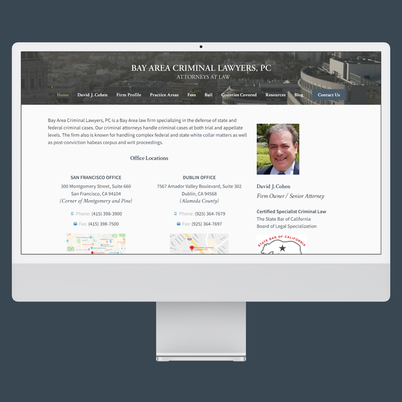
Project Overview

A prestigious San Francisco law firm needed their dated legacy website redesigned and rebuilt. There was a rich base of content, but it was divided between 7 sub-domains with separate mobile and desktop markup. The firm wanted to manage the content themselves, rather than relying a contract developer each time.
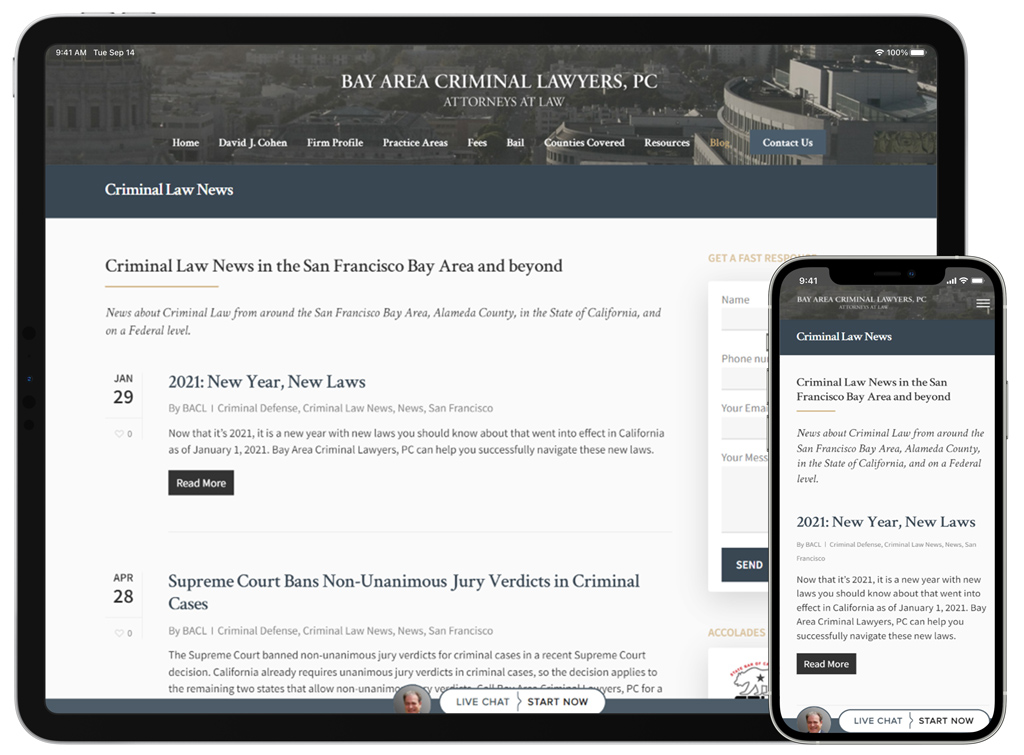
Objectives

  • Provide a trusting brand experience to appeal to potential clients, employees, and clerks.
  • Empower the client to create and modify content with WordPress.
  • Conglomerate all content and subdomains into one cohesive website.
Responsive Web design for tablet and mobile

Process

Research & Analysis

  • Leveraged previous experience with the firm to explore several user types and conversion objectives.
  • Heuristic analyses on the current site and each of the subdomains.
  • UX competitor analysis across the large city law firm space and specific firms flagged by the stakeholders.

Ideation & Planning
Based on research insight, I focused on elevating the brand sophistication with a trusting color scheme of dark blue and gold. Headings use the Crimson Text serif typeface for it’s sophisticated and traditional conations. With accessibility in mind, this content rich site uses Source Sans Pro for body, interface, and auxiliary copy. Focused on optimizing content creation task flows to eliminate duplicative work on contractor reliance.

Website Buildout
  • Developed WordPress child theme for all content, brand information, and resources.
  • Leveraged custom post types and templates to ensure a consistent application of the design system.
  • Implemented fewer and smaller images compared to competitor sites for a focused and situationally appropriate user experience.
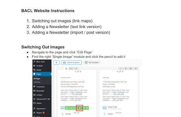
Website documentation for WordPress users
Testing & Refinement
The client was impressed with the visual design and layouts in the staging environment, but they were unclear about managing it. Detailed documentation for each of the functions and capabilities was created to onboard existing and future employees. To address concerns of static content on pages, dynamic blog feed blocks by category and tags were added throughout the site.

Outcomes

The initial launch and reporting period saw many positive comments from the firm and their clients about the visual design of the website and branding. The custom templates and detailed documentation allowed employees to publish their first posts quickly and on their own.

80

Reduction in time to manage content

8

Websites consolidated into a single experience

100

Responsive design sitewide
Lawyer website shown on desktop computer.